The following pictures are images I have thought about using for potential Poster images...


 This is the track listing actually transitioned onto the digipak. I think the font really works against the 'Waves' background. The shadow on the font works and relates to the shadowing on the water/waves from the sun on the background image. There are 10 tracks. This is because a number of indie albums I looked at, had either 10 or around 10 tracks. I didn't want to over do it and make it look un-realistic or make it not match the indie genre and style of bands. The barcode creates a product-like feel to it and finishes off the panel for my digipak.
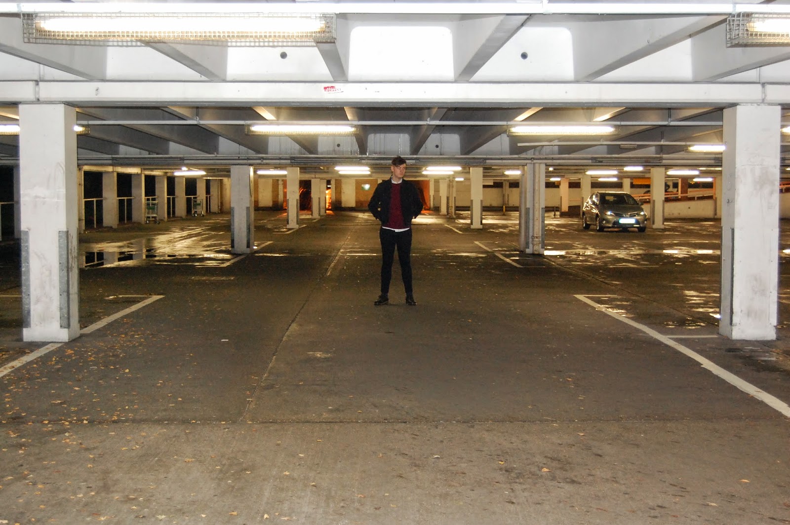
 Due to difficulty in scheduling times, we have had to change the characters in our video. Originally, we had our friend Beth and her boyfriend. However, he was not available until after 17:00 on weekdays which limited our time with lighting and general filming. The scenes they would have featured in, were the driving scene where the couple are on their way to one of the bands gigs.
