Friday, 30 January 2015

Image ideas for my poster...

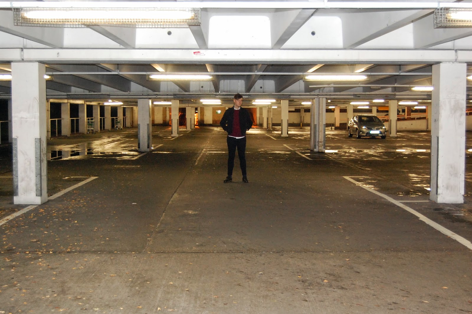
For my poster, I was unsure wether I wanted to use an image of the band, or like the digipak, a landscape picture that represents the style of the band. In my bedroom at home, I have a number of band/artist posters ion my wall, therefore I examined those and took ideas from them to incorporate into my own. With bands like The 1975, Kings of Leon and Catfish and the Bottlemen, all similar to Two Door Cinema Club, None of them used images of the band. Album covers were used, or landscape imagery of cities and towns etc.

The following pictures are images I have thought about using for potential Poster images...


Thursday, 29 January 2015

Favourite music video...

My favourite music video is The 1975's video for their single 'Robbers'. The official music video was released on 28 April 2014. Directed by Tim Mattia, the video depicts a pair of lovers, played by band frontman Matthew Healy and model, Chelsea Schuchman, who rob a shop to obtain money to fund their alcohol and drug addiction.

Tim Mattia has directed many other music videos for artists such as Tine Tempah, Marilyn Manson and Conor Maynard. It was interesting when researching Mattia and noticing how different in genre the artists he has worked with are.
  • Tinie Tempah - British rapper Tinie Tempah released his debut single "Pass Out" in February 2010. Featuring the track's producer Labrinth, the single debuted at number one on the UK chart.
  • Marilyn Manson - Marilyn Manson, is an American musician, songwriter, multi-instrumentalist, actor, painter, multimedia artist, and former music journalist. He is known for his controversial stage personality and image as the eponymous lead singer of the band Marilyn Manson
  • Nicole Scherzinger -  Nicole Scherzinger is an American recording artist, actress and television personality. She signed with Interscope Records in 2003 as a member of the Pussycat Dolls.
The range and differences between these artists were interesting, however, when looking at the videos of the artists that he directed, there is an ongoing theme of colour and shots. He seems to use the same filter on his videos creating a dusk effect.

This is my favourite video as the narrative is beautifully put together.

From my knowledge and interest for this band, I originally knew that the video is a recreation of Shakespeare's 'Romeo and Juliet'. It shows the love and death between the two characters.

It is a fantastic video that really draws its audience in as the whole band feature in the video, and the lead singer, who is an icon for their female audience, plays the 'Romeo' character.

Wednesday, 28 January 2015

Font styles for our artist...

In Wednesday's lesson, we looked at different types of font on a website called DaFont. We wanted a font that would represent us as a band. We looked at other bands that have a font that people recognise as 'being their font'.

When you look at classic rock bands, they all have a font/logo that represents themselves as a band. Bands such as Metallica whose font has a lightning strike looking symbol coming off of the first and last letter in the word. The font is black, representing their dark aggressive image of the metal music they produce.


The original artwork of the Rolling Stones lips and tongue logo is one of the world's most instantly recognisable symbols of rock and roll. Their red font is also a key recognisable symbol of them as a band.


Oasis are known for their Italic white font in the black box. When this style is seen, or a similar font type, the general audience would instantly think of or assume it was the band Oasis.


In more recent years, bands like Arctic Monkeys are known for their white font in the black circle, and their sound wave logo from their fifth studio album, AM.

Monday, 26 January 2015

Slow-motion effect

By owning an iPhone 6, I had the accessibility of using the slow-motion effect on the camera. We thought it would be cool to have a section in the song that was slower than the rest, to contrast with the fast paced audio track. During a shoot, unplanned, Shaun filmed a scene on the iPhone and we were overly pleased with how it came out. We ended up using the following clip and we think it looks really great in contrast to the lively performance on the rest of the track.

Wednesday, 21 January 2015

Feedback 21/01/15

In today's lesson, we showed our second draft to the class, and we got feedback via these sheets.

The main feedback we got, was to change the drummer as he wasn't very realistic when playing the drums in our performance sections within our video. We are going to reshoot and focus a lot more on what drums are being played at that specific moment in the song, and try t replica them to the best as possible. If that fails, hen we will have to change the drummer overall.


Saturday, 10 January 2015

Plan for band poster...

I have decided to use this image as it has a great contrast with the overall look of my digipak. The sepia style works really well, giving a vintage look to our digipak, linking in with our bands interests of vintage clothing and 80's music. The picture of the pier resembles a beach linking in with the name of our band, 'Waves'.

The text I have added, mainly to get a feel to see if it works among the image, matches the font that features on the front of my digipak. I have kept this font to write all information featuring on both the digipak and poster. I think it works really well and stands out as being the font used for 'Waves'. Linking in with another blog post I did, I wanted to get a font that would resemble the band and be noticed for being the band font, almost acting as a logo in itself.